
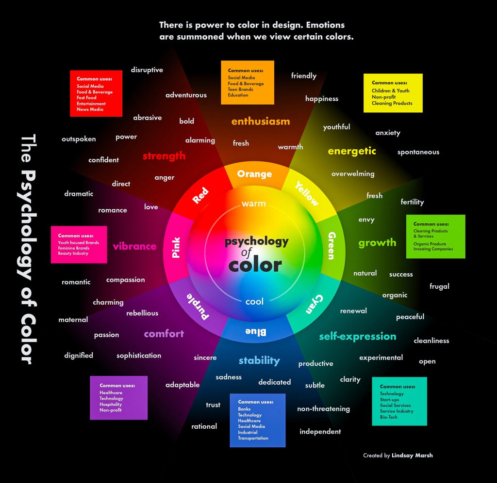
The Psychology of Colors for Branding: How to Choose the Right Palette for Your Brand
When it comes to branding, the colors you choose for your logo, website, and marketing materials can have a powerful impact on how your brand is perceived. Color psychology is the study of how different colors affect human emotions, perceptions, and behaviors, and it’s a vital tool for businesses aiming to connect with their target audience on a deeper, more emotional level.
In this post, we’ll explore how different colors influence consumer behavior and how you can leverage color psychology to create a strong, memorable brand identity.
1. Red: Energy, Passion, and Action
Red is a bold, dynamic color that grabs attention and evokes strong emotions. It is often associated with passion, excitement, love, and urgency. Brands in industries that want to convey energy, power, and enthusiasm often use red in their branding. Think of brands like Coca-Cola, McDonald’s, and YouTube, all of which use red to stimulate action and encourage engagement.
- When to use it: If your brand wants to inspire excitement, spur action (like urgency in sales), or convey power and strength, red is a great choice.
- Psychological impact: Red can increase heart rate and stimulate adrenaline, making it ideal for industries like sports, entertainment, and food.
2. Blue: Trust, Calm, and Professionalism
Blue is often considered one of the most universally liked colors. It’s associated with trust, reliability, and professionalism, which is why it’s a popular choice for corporate, financial, and tech companies. Brands like Facebook, IBM, and PayPal use blue to create a sense of stability and security.
- When to use it: If you want to evoke trust and professionalism, blue is an excellent choice. It’s particularly effective in industries like banking, healthcare, technology, and consulting.
- Psychological impact: Blue tends to have a calming effect, lowering stress and fostering feelings of loyalty and confidence.
3. Yellow: Optimism, Happiness, and Attention-Grabbing
Yellow is a color that immediately draws attention and is often associated with sunshine, happiness, and optimism. Brands that want to evoke a sense of joy or positivity often incorporate yellow into their branding. Examples include brands like McDonald’s, IKEA, and Snapchat.
- When to use it: If your brand’s goal is to promote optimism, creativity, or happiness, yellow can be a great choice. It’s also a color that is often used to evoke curiosity and grab attention.
- Psychological impact: Yellow stimulates mental clarity and can increase feelings of happiness and energy, but too much yellow can be overwhelming, so it’s important to use it in moderation.
4. Green: Health, Nature, and Growth
Green is strongly associated with nature, health, growth, and harmony. It’s often used by brands in the health and wellness, food, and environmental industries. Think of brands like Whole Foods, Starbucks, and Tropicana, all of which use green to convey a connection with nature and sustainability.
- When to use it: If you want to emphasize sustainability, organic products, or a healthy lifestyle, green is the perfect choice. It’s also great for brands focusing on relaxation or personal growth.
- Psychological impact: Green has a calming and balancing effect, promoting a sense of relaxation, renewal, and wellness.
5. Purple: Luxury, Creativity, and Royalty
Purple has long been associated with royalty, luxury, and creativity. It’s a color that conveys sophistication and elegance, which is why it’s often used by high-end brands. Companies like Cadbury, Hallmark, and Airbnb use purple to convey a sense of premium quality and innovation.
- When to use it: If you’re positioning your brand as a luxury or premium product, purple can help communicate that message. It’s also great for brands in the creative, artistic, or spiritual fields.
- Psychological impact: Purple can stimulate creativity, calm the mind, and evoke feelings of luxury and exclusivity.
6. Orange: Fun, Friendly, and Enthusiastic
Orange is an energetic, playful color that combines the warmth of red with the cheerfulness of yellow. It is often associated with creativity, enthusiasm, and fun. Brands like Nickelodeon, Fanta, and Home Depot use orange to create a welcoming and approachable image.
- When to use it: If your brand wants to feel fun, youthful, and approachable, orange is a great choice. It’s also effective for promoting value or affordability.
- Psychological impact: Orange can stimulate enthusiasm and creativity, making it ideal for brands that want to foster excitement and engagement.
7. Black: Sophistication, Elegance, and Authority
Black is often associated with sophistication, luxury, and authority. It’s a timeless, versatile color that is frequently used in high-end branding, fashion, and technology. Think of brands like Chanel, Apple, and Nike, all of which use black to convey elegance and simplicity.
- When to use it: If you want to convey sophistication, power, and luxury, black is the perfect color. It works well for fashion, technology, and high-end products.
- Psychological impact: Black is authoritative and sleek, often associated with professionalism, formality, and exclusivity.
8. White: Simplicity, Cleanliness, and Purity
White represents simplicity, cleanliness, and purity. It’s often used to convey minimalism and modernity. Many tech companies, including Apple and Tesla, use white in their branding to create a clean, sleek, and minimalist look.
- When to use it: If your brand focuses on simplicity, innovation, or cleanliness, white can be a great choice. It’s also ideal for brands promoting purity or health.
- Psychological impact: White creates a sense of space and clarity, evoking feelings of freshness and minimalism.
9. Pink: Femininity, Compassion, and Playfulness
Pink is often seen as a soft, nurturing color, associated with femininity, compassion, and love. It’s commonly used by brands that target a female audience or want to promote a sense of care and warmth. Think of brands like Victoria’s Secret, Barbie, and T-Mobile.
- When to use it: If your brand is focused on beauty, fashion, or care, or if you want to convey a sense of playfulness or warmth, pink is a great option.
- Psychological impact: Pink evokes feelings of compassion, kindness, and nurturing, making it ideal for beauty, wellness, and youth-focused brands.
How to Use Color Psychology in Your Branding
Now that you have a better understanding of how different colors influence emotions and perceptions, here are some tips for using color psychology effectively in your branding:
- Know your audience: Different demographics may have different associations with color. Make sure you research your target audience to ensure your color choices resonate with them.
- Be consistent: Consistency in color usage across all brand touchpoints helps build recognition and trust. Use your chosen colors in your logo, website, social media profiles, and marketing materials.
- Consider cultural differences: Colors can have different meanings in different cultures. If your brand is international, be mindful of these differences when choosing colors.
- Test and optimize: Colors can affect consumer behavior in subtle ways, so don’t hesitate to test different color palettes and see what works best for your brand.
Conclusion
Color is a powerful tool in branding that goes beyond aesthetics—it influences how people feel, what they associate with your brand, and even their purchasing decisions. By understanding color psychology and choosing the right colors for your brand, you can create a deeper connection with your audience and leave a lasting impression.
So, whether you’re designing your logo, building a website, or crafting a marketing campaign, be sure to carefully consider how your color choices will influence your brand’s message and the emotions you want to evoke.
By strategically leveraging color psychology, you can enhance your branding efforts and create a visual identity that not only looks good but also resonates deeply with your audience.
Until next time, take care and keep shining! 👋🏽✌🏽🐝✨
This blog has been made for educational purposes. I used ChatGPT by OpenAI to assist with the development.
Leave a Reply